Thursday, March 20, 2014

Project 15: self portrait

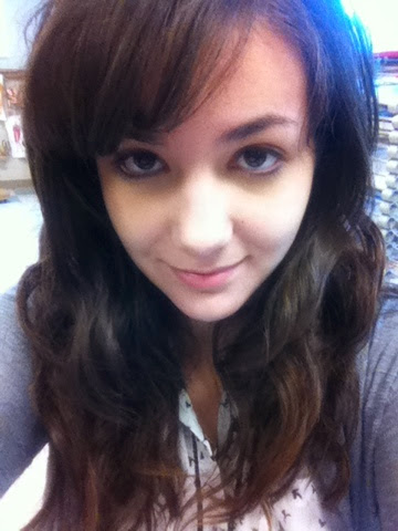
One of our assignments is to do an expressive self-portrait so after I completed my portrait of my goddaughter I decided to do one of myself. I started by taking a selfie but I didn't like my hair in the picture...

so I used the hair from another picture that I had of myslef.
I then free-handed the picture and layered my colors and ended up with this:
(this is a strangle angle to take the picture at, I swear the head isn't this misshapen in the real one)
(why can't I turn this, I don't know..why can't I, Blogger????)
Another reason I really wanted to do a self portrait is that I'm constantly reminded on how well (or not-so-well) I did in Art one. I'm reminded because one of my teachers put my old self portrait on the art room wall...

Wow I was really bad. But art is a skill that you can develop over time and you can't let your current art skill deter you from getting better. I'm often inspired by other peoples art, but not necessarily in the way where I try to do the same style of the artist, but rather aim to improve my own art skill so I can be at their level. Anyone can be a artist if they want it bad enough and stick with it. Want proof? Here's a 3 1/2 year difference in my art skill:


And I'm still getting better. I'm really pleased with the end result of this project, my art is still not quite where I would like it to be, but i look forward to doing a self portrait in another 3 years and seeing how much better I am.
Project 14: Vivian

For my next project I wanted to do a portrait of my goddaughter Vivian. I had started on a portrait of her younger sister who is also my goddaughter, Rosalie, and wanted to draw Vivian too. A classmate of mine is really good at portraits and, honestly, I want to try and get as good as she is at it. But my first attempt...not so successful.
Yea...not good. Skin color is hard but I was determined to get it right. I started with pinks and purples and added yellow and brown before any skin tone prismas. I started to practice her eye and using colors to add depth to the skin...
I really wanted to get this right, so I tried-tried again.
I traced the important lines of the face, I wanted to get the outlines right because it's really hard to draw children and the technique i really wanted to practice was using skin colors.
I re-traced the lines with a white pencil and started using oranges and purples to bring out shadows and highlights. I layered yellows and browns and skin color pencils and did a lot better than the first time. I then did the hair, which was a lot easier for me since i've drawn hair many times before. This is the final project:


Much better, right? Overall, I'm really happy with the end result and glad I kept going after my frustrating first attempt at  coloring skin. If I were to do it again I would color at more directions so that the texture wouldn't be so wood-like.But I'm still pretty pleased with this.

Project 13: My insect lady

For my next concentration piece I was in a little bit of a rut. My concentration is someone being so obsessed with something that it literally consumes their body and destroys them either mentally or physically. There are a lot of things that people can be obsessed with but not all of them translate easily into the whole "taking over the body" thing. I had already done food, animals, and dolls, but what else? Insects. This is my insect Lady. I started out with a sketch, I wanted her to sort of be skipping crazily with her new grasshopper leg...
Yea...not so good. I wasn't really thrilled about my original sketch so when my teacher told us to do something inspired by steampunk, one of my favorite type of styles, I changed her design right away:

It took me a whole period to finish her design, but I'm really happy with the end sketch.
I then practiced different ways to use the prisma colors with other media.
My original plan was to use ink with the prismas to make the steam punk element stand out.
I then replicated my design on a large piece of paper and spent hours getting in the right colors. I couldn't bring myself to go over it in ink so I just darkened the background with watered down ink and blue and red prismas. Here is the end result:
The picture does not do her justice but she is a great addition to my concentration family. She fits right in to my half-anime half-realistic style and I'm pretty proud of her.


Project 12: My cat Marble

My Cat
This semester we are really being pressed for time when it comes to projects so I decided to get something quick done. I decided to do a small portrait of my cat and started by taking a bunch of pictures of him.
I really liked the last picture because of the detail in the fur that you could see even with my iphone camera. It was a really nice angle so I started to free hand the outline and used short strokes with prisma colors to do the hair. When I made my animal lady I had to use this technique multiple times for multiple animals so I was very used to drawing fur. Two hours later and...


This is the result. I'm OK with the end project but I wish I had spent more time on it. if I were to do it again I would take more time to pay attention to detail and do it on a larger scale or with sharper pencils so I could make it more realistic. I would also probably use a different color paper because white isn't always the best when working with fur. But overall, it's a cute little project in my opinion.

Project 11: bottle

See-through bottle
For our first project this semester we were told to do a project using prisma colors to show something that is see-through. I wasn't very excited about this project because we are normally left to our own devices when it comes to projects so having something that we had to do wasn't a very welcome change. I was very uninspired by the see-through concept, so I just ended up photographing stuff in my room. Swarovski crystals, a perfume bottle, bath balls in water, none of it really interested me visually... so I just took a empty vodka bottle and filled it with water colors and ink.
This actually sort of worked for me.
I took around 20 pictures but this is the one I liked the most, so I practiced drawing it in my sketchbook with watercolor prismas

My original sketches didn't really have enough dimension so I added regular prisma colors to help with that.


After doing this I decided for my final to trace the original picture onto black paper, just because there were a lot of details I had missed in my sketches. This project took a really long time to color, and the highlights still weren't bright enough so I used a sharpie paint pen to make them brighter.


Overall, I guess this project was ok, but not my favorite. My least favorite part is definitely the hand because the black paper made it hard to make a good skin tone. My favorite is probably the bottom of the bottle because it actually looks like the bottom in the original picture.