Wednesday, December 11, 2013

Project 9: My doll queen

   There once was a girl named Emelie who was a very peculiar child. She had no friends but lots and lots of dolls. She was dearly obsessed with those things. In her own private world in her own little head she would be the doll's queen. She had a grand castle on the top of a tall hill and a beautiful tree and of corse all her subjects, her dolls. Tea time was at noon on the dot and never a moment later and there was a ball every midnight where everyone wore pretty dresses. Dress-up started at four before dinner, there were fairies and doctors and mermaids...but no one could dress as a princess...except, of course, Emelie.
But one day something changed in Emelie that no one could explain, she started being mean to all her dolls, but one doll got it worst of all. It was a Barba Doll that she had just gotten for her Birthday, she had loved everything about her...well, except for one thing. The Barba wore a pretty pink crown that couldn't be removed...Emelie got mad and screamed "I'm the princess! NOT you!" She threw a fuss that rang out so great that her skin began to crack, for it was now made of porcelain. Her obsession morphed her body and mind and it was only a matter of time before doll heads started forming out of her morphed body.  Her heart turned gray and so did her world. Her once bright kingdom now a dark empire. She rules with an iron fist, destroying all the subjects she once held dear, in fear that they will rise against her throne. Her scepter is now the headless Barbra and her cape is adorned with the heads of her victims. No heads means no doll can ever wear a crown again. Only Emelie can dress as princess...
Hope you liked my story, this is Emelie, my doll queen. I started her as part of my concentration. I started by sketching her out:
I really liked her look and how creepy she was so I started right away.

Like my other concentration pieces, I wanted her to be drawn on a huge piece of paper. This proved to be the wrong corse of action:

Her proportions were extremely off and her line work was not the best. She needed to be thinner to look more creepy so I restarted on a smaller paper. This worked a lot better and a lot faster. I drew the whole thing out and outlined it in the span of one class period and it only took one period to shade. I thought I was done...but apparently wasn't.

A lot of my art has no background and if it does it's normally just a color or shadow. I have never liked drawing backgrounds in my art because it takes focus away from the character, especially when poorly done. I don't normally create landscapes, it's just not my thing; so I'm not too good at creating backgrounds. But I guess I'd gotten sway with one too many background-less pieces... so when I asked Mrs Rossi what the piece still needed...of course it was a background.

My first thought was to make a room full of doll boxes, but that was too busy. Then I thought about the minimal, which was making dolls bow down to her...but thought it wouldn't look right. Ultimately... I went for a simple background. I drew out a large and creepy tree and then a sort of mountain landscape. She's a queen so she needed a castle and of course...dead subjects. So I started on this idea:
When I started shading I knew I wanted dark values but I needed more control than ink or watercolor. But.. I didn't want to use just pen either because it is very tedious and wouldn't look right anyways. I once saw someone use pen and pencil together in a video, so decided to go with that. I used different pencils for the darks and lights and used a black colored pencil for the harsh darks. 
I then worked on the gradation of values in the background and worked in minor lines and details. It actually turned out pretty good. simple enough that it didn't take away entirely from Emelie but complex enough to make it an actual background. I outlined the main figures in pen to emphasize them and my project was complete. Here she is:
                   My Doll Queen


Thursday, December 5, 2013

Project 8: My Animal Lady

When I started this project I had been really frustrated with my recent art. The portrait I had made of Santiago wasn't looking right and the animation I had tried to do was taking forever and not looking too good. I also had this frustration in sculpture class so instead of working on our project at the time I started sketching. I came up with the idea of a lady who is so obsessed with animals that it consumed her... 
I was so happy with the idea that I took a large piece of paper home to work on it. I ended up going to a small trail in my neighborhood, sitting in the leaves and drawing her for a hour or two. I was really happy with it and outlined it right away
This is the first project I had been totally inspired by since My Fat Man, this project helped me lock on my concentration. The idea of a obsession literally taking over the body really inspired me. But I knew I wasn't done yet. I was really happy with the outline but I knew it needed color. I never really use colored pencils in my work but wanted the detail they create so I chose that as my medium. The drawing class that goes on at the same time as Art 4 had just recently completed animal works using prisma colors, so I asked one of them how she had used the prisma colors to make the illusion of fur. The best advice I got from this was to look at the direction of the hairs, this really helped my realism. I practiced this technique A LOT before starting and then began on my final. 
I was REALLY happy with my progress though this project took a lot of time and energy. I had to work on each animal individually 
Afterwords I worked in skin tones using peach colors and brown. I worked in details like pink skin around her wounds and small blue veins in her skin. Originally I wasn't going to make veins but made a accidental blue mark. It worked to my advantage though, just added another detail.
This is what she looks like now... I think I'll name her Tiere (animal in German). I'm not sure yet whether or not she is finished, I may or may not add a forest background. I have gotten comments where people have wanted me to put in a background and others wanted me to keep it this way so she is the main focus of the work. But for now I am really happy with what I accomplished.


Tuesday, December 3, 2013

Project 7: food color water color

So this project started out as a portrait of my boyfriend using hashtags and at symbols. I thought this was a cool idea and practiced it in my sketchbook: 
I got the idea cause I drew him for a homework assignment:
But I wanted to try and draw him with a different kind of mark, hence the # and @. But in the process of making the final I rushed because I wanted to get it done but it ended up looking sloppy. I tried cutting parts of it and putting cuts of paper on and using numbers and signs to make it more interesting...it didn't work. 
But just as I was about to give up on this project, he got me flowers as a first month anniversary thing 
I was inspired to draw the flowers and decided to do it over top of the portrait. I cut up some extra paper and glued it to the top of the portrait, only leaving a little of the original showing. I then drew the flowers on top of it. 
A while back I discovered that if you mix food color and water you can use the mixture like watercolors. I used this method to paint over top the flower. If you try and do this yourself just make sure you use enough water or the surface will get sticky. The hardest part about using this medium is layering the colors. 
Here is the final project:
Overall I'm really happy with the end project, especially because it took less time than a lot of others. 


Project 6: Layer it On

So my art 4 class is in the same room as the drawing class and they were doing collage using tissue papers and cut-outs from things like magazines. 
We were asked to participate in this too, creating a collage on two pages in our sketchbook. In art 2 I absolutely HATED our collage project, so I didn't think i would enjoy this side assignment very much but....
 
I ended up making something I really liked by using the tissue paper. When wetted the tissue paper leaves color on the surface of the paper or magazine, it leaves a really cool effect. So I made another collage that fit perfectly into one of the topics we could use, layer it on.

So I started out by making a mistake: choosing a bigish piece of paper which makes it really hard to cover the whole surface. But I did it anyways. I first cut out pictures I liked from magazines and glued them to the paper. I planned out the placement of some of the pictures but you cant plan too much because you have to take off all the pictures when you glue them down. So Yea... Not much planning. Then I took tissues and wetted them so the color would drain onto the page. I added some more pictures on top of the colors to help them stand out a bit but ended up covering those with color too. I finished it with a clear medium which makes it shiny and keeps the corners of the pictures from lifting up. 
Here's the final product:
Overall I'm very happy with it, it's cool and vibrant and colorful. I'm glad I gave collage a second chance.


Tuesday, October 29, 2013

Project 5: Mustasches

For my fifth art assignment I again took inspiration from a homework assignment (mustache-inspired for sculpture class), a self-portrait with a mustache finger. Mrs Rossi gave me the idea to do multiple prints with different mustaches. I chose to do the prints in complementary colors. I started by making a large print and used watercolor 
But Mrs Rossi asked me to use acrylic instead and to make smaller prints. I took my original image and scanned it into the computer, I then shrunk it and outlined it onto tracing paper. I redid my practice in acrylic and got this:
I was pleased with the more vibrant colors and so I cut out 9 squares of paper (I wanted to make a square and groups of 3) and traced each one individually with the tracing paper. I then retraced with sharpie. I then painted each in 3 different color schemes (a separate 4th later) but ended up messing up 3 of them (you should always make extra sheets...) one of them I messed up by making her face green... Always check ALL of your color schemes BEFORE doing on your final >~<. Unfortunately... The darker colors completely whipped out my lines and I had to retrace with a sharpie marker which is REALLY hard to do cause it fades... But managed it pretty well. Here is the final:


Tuesday, October 8, 2013

Sketchbook Assignment

We were given the assignment to take a 3D object and make it into a 2D art piece. I took a leaf and some flowers and a twig and turned it into a girl with a leaf umbrella walking past a tree in the rain. I think it looks pretty cute.... I used two different sharpies to make the outline and then used pencil to shade.

The End :D

Monday, October 7, 2013

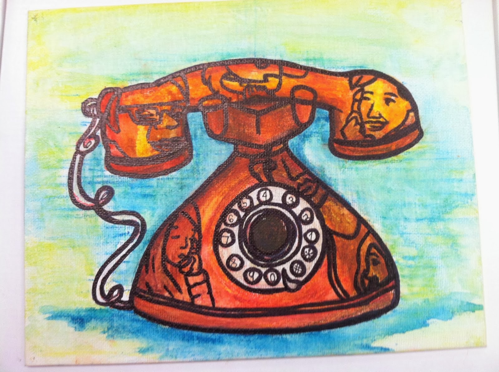
Project 4: Phone Thingy

This idea just came to me because I have a old fake phone in my room that I bought at a Church yard sale for 2 dollars. Unlike my other art pieces thus far, this one doesn't really have much meaning. I mean, I'm sure you could make up something like "the people are trapped or consumed by the phone" or something artsy like that, but really...I just wanted to draw people in a phone. I did a lot of preplanning for this... took pictures, gathered references, put them in my sketchbook, made multiple sketches... but I wasn't really inspired by it and had to force myself to do it.


 references
 sketchy-sketch
 sketchy 

I really didn't want to do this project, but I had to get a fourth project done and ended up doing it all at home on one of the days I didn't have work. (I work a lot =.=' unfortunately.) I drew it all in pencil on a small canvas I had lying around and then traced everything in red. I then used prismacolors to color the sketch in and drew over the lines a second time with a black Bic permanent marker. because the surface was textured, the pencil and prismacolor got everywhere, it was really annoying. Once I got to school I decided to take it a step further and used water to blend out the prismacolor (mine are water-soluble). I added some shadow and ended up with this:


I think it turned out pretty well................................yup.